web design
east cheshire hospice
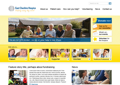
The Hospice wanted a new design that was warm, friendly and inviting, as well as informative for patients, their carers and medical professionals. They didn't want to be seen as 'a place to die'.
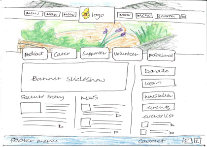
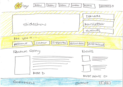
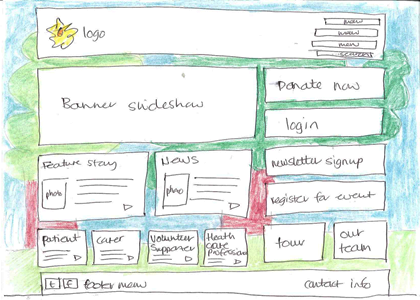
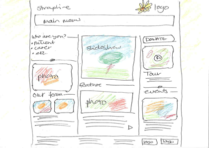
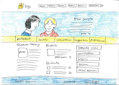
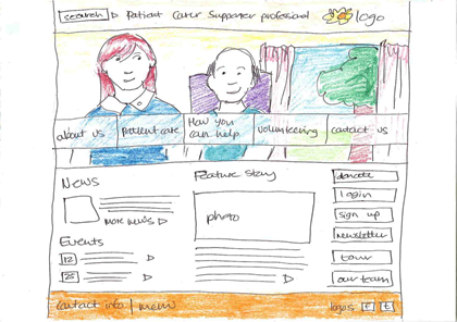
The Hospice had worked with designers before and saw great value in seeing thumbnail sketches before the final Photoshop design creation, and I was happy to work this way and show rough sketches first.
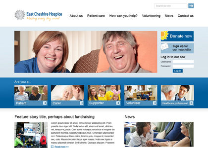
I had a look at other UK hospice websites and the vast majority of them looked dated - the staff's priority is to be looking after patients rather than updating the website so I wanted to create a site that was simple for them to maintain, and hopefully something that they would enjoy working with. The hospice colours are blue and yellow, so I chose the yellow as a base for the first design to bring warmth and cheerfulness, and I did a blue version too in case the stakeholders found it to be too bright. I also included gradients and geometric background textures to make the design feel more modern.
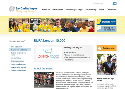
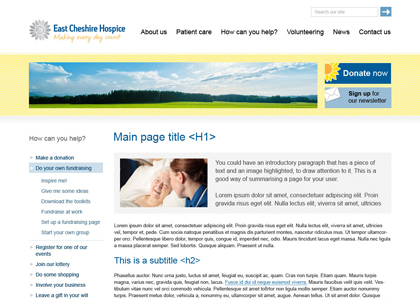
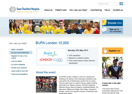
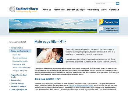
The designs shown below are my first draught rather than the final design approved by the Hospice. Please click on the images to have a closer look.
