web design
epilepsy society
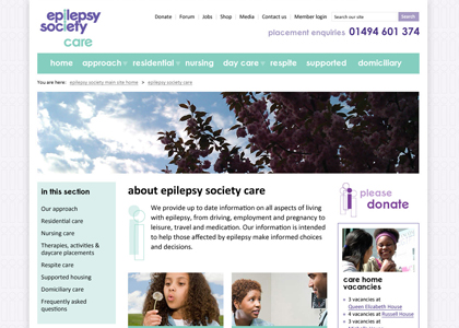
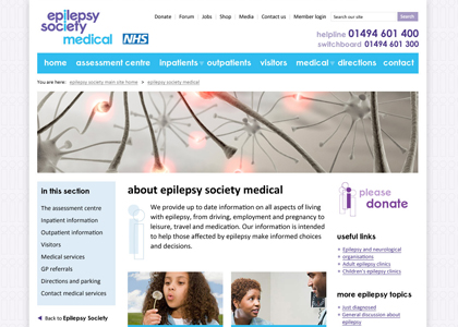
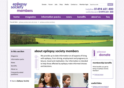
Epilepsy Society did a IA/UX session with us, and from that we designed a website that fulfilled the brief, stuck to branding, and was also considerate to users with epilepsy. They had a tight budget so we didn't have much time available to do different iterations of design concepts.
The design itself is simple and very practical - there is a lot of important information to convey and the users and their condition were always foremost in our minds as the motivation for the design. I played with the branding and used the 'i' motif as outlines, with overlapping elements, for the first time (the branding manager admitted that she liked it!). They have 3 microsites for their Care, Medical and Members sections, so I used the same design and structure but changed the colour schemes to suit the specified branding. I also learn a lot about epilepsy by working on this project....